Luxe finishes – the psychology of colour in your home

By Mercedes Newsome-Jones posted in Company News published 25 Jan 2023

Company News

Can we talk about colour? The thing that brings this world to life, creates spectacles to behold, we’re thinking the Northern Lights, Amazon Rainforest, the Indian Ocean to name a few. Now what’s this got to do with interiors I hear you say? Well in a nutshell, inspiration, and the feelings that colour can evoke.

The study of the psychology of colour details how different colours stimulate emotions, feelings, and behaviour. How does the colour red make you feel for example, love, passion or perhaps anger? Or does it have the opposite effect on you, and does it elicit excitement instead?

Because colours can have such transformative effects on us, it’s important that we choose wisely when renovating and decorating our homes. A good professional Interior Designer will explore this with clients when designing a space for them to ensure it not only looks great but feels good too.

So how can we utilise this knowledge to create a space that not only looks great but adds to our overall health and wellbeing?

Here’s our advice on which interior colours are on-trend and how they make us feel, as well as how they can be used to transform your space and wellbeing…


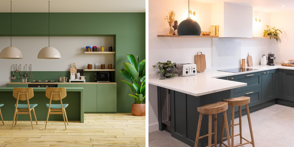
GORGEOUS GREENS – Nature, Healing, Freshness, Quality
One of the most popular of colour choices for kitchens currently. We have seen darker shades of racing greens around for a couple of years now, but we are starting to see a shift towards softer shades like Sage and Olive, which we happen to love by the way. Green symbolises nature and tranquillity, so this hue is perfect for creating a peaceful space to relax and unwind in after a busy day. It can also help bring the outside in and vice versa, think connecting the greenery of the garden to the busiest hub of the home.

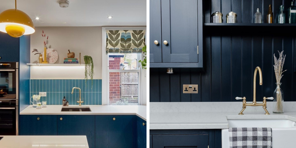
BOLD BLUES – Trust, Peace, Loyalty, Competence
Bold blues have also dominated the world of interiors for some time. Blue is one of the strongest hues on the colour spectrum and brings with it feelings of calm and sereneness, this shade has typically been paired with lighter, brighter colours like White, which really makes that blue pop but also ensures the space is not too dark.  Blue is thought to bring about feelings of confidence and is linked with loyalty, trust, peace, and success. A popular shade in the world of kitchens is Navy blue however we are starting to see lighter shades like Nordic Blues and Cobalt Blues which offer a more contemporary and modern style, these shades are fabulous when paired with black hardware, sinks and taps but we expect these Scandi influenced colours to enable an array of other options in 2023.

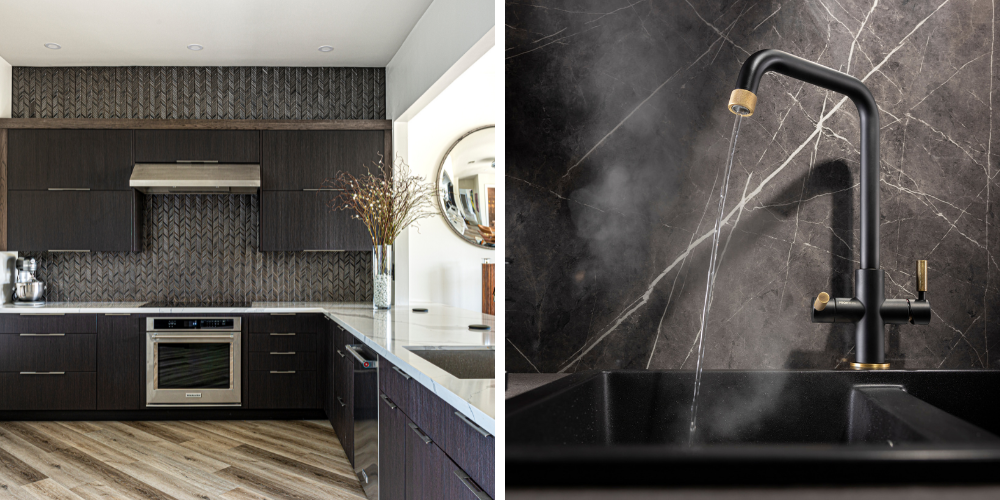
BLACK IS BACK – Formality, Dramatic, Sophistication, Security
 Now let’s move onto the dark and dramatic, matt black. If you are daring enough to opt for a dark kitchen, then you may be wanting to feel protected and secure, cocooned as it were in the comforts of home. Now for those of us not brave enough to move totally to the dark side, there are smaller things that can be changed, for example a black kitchen tap and sink, to match in with kitchen hardware and light switches to add impact and add the wow factor to any kitchen. Remember black makes us think of elegance and sophistication, and who doesn’t want to imagine themselves as Lord or Lady of their own manor?!

R: NEW Pronteau Industria 3 IN 1 Hot Water Tap

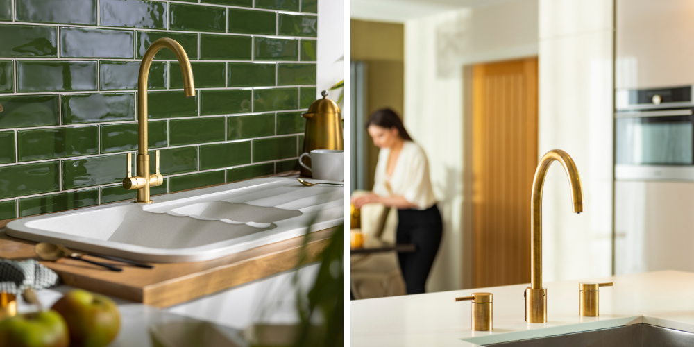
AS BOLD AS BRASS – Success, Affluence, Indulgence
Synonymous with luxury, gold is the colour of wealth and success. And we say gold, but any form of gold or brass finish evokes that idea of indulgence and opulence. Which is why this is such a popular trend in kitchens. These finishes are used in kitchen taps to offer a luxurious look and to create a focal point and will usually be paired up with handles of similar finishes to create a stunning masterpiece. These finishes really stand out when paired against a kitchen backdrop of strong blues and greens.  And remember, gold is a colour that is linked to winners!

L: Pico Tap in Brushed Brass R: Pronteau Profile 4 IN 1 Hot Water Tap in Antique Brass

So, when planning your next kitchen project, think carefully about how the colours will change your mood, after all we all spend a considerable amount of time in our kitchens. Whether you opt for calming hues or something more bold and daring every option will elicit different feelings, so consider how you use your space when you consider colour and everything else will fall into place.

Back to news
Previous Post Abode launch Naturalé Water Filter Tap - Big conscience. Minimal impact.
Next Post Abode appoints Karen Parker as Northern Sales Manager

Related posts

Case Studies
09 August 2024

Abode partners with Skipton Properties

Abode, award-winning designer and distributor of market leading kitchen taps & sinks, bathroom taps & showering solutions is delighted to announce its new partnership with family-run property development company, Skipton Properties, leading experts in the supply of new build homes in Yorkshire and Lancashire.

Read More
Inspiration
24 March 2025

Scandinavian Style

Hygge at Home. The Beauty of Scandinavian Interiors.

Read More

Get inspired from our instagram channel

Follow us